

Strategically Redesigning the Information Architecture to Improve Resource Access and Boost Website Traffic
The Instructional Materials Toolkit (IM Toolkit) is a resource designed to help educators select and implement instructional materials that support student success and align with academic standards. However, users often felt overwhelmed by redundant resources and an unclear page hierarchy, making it difficult to find what they needed. This frustration frequently led them to leave the site.
By leveraging insights from user feedback, stakeholder goals, and budget constraints, I redesigned the site with a more intuitive information architecture, improving navigation and resource accessibility for educators.
As a result, site visits increased by 65%, and resource findability improved by 80%.
PROJECT DETAILSTools: Optimal Sort, Google Surveys
Timeline: May 2024 - Oct 2024
Role: Product Strategist
Platform: Web

COLLABORATING WITH STAKEHOLDERSI talked with stakeholders to gain insights into their business goals, expectations, and concerns with the IM Toolkit to inform the design process and build a strong foundation for a collaborative partnership.
The Partnership for Los Angeles Schools (PLAS) is a nonprofit organization that collaborates with the Los Angeles Unified School District (LAUSD) to improve outcomes in underserved schools by providing support, resources, and innovative strategies, with funding tied to the success of its projects.
The IM Toolkit supports PLAS’s broader goals of improving school performance, enhancing teacher effectiveness, and closing achievement gaps. However, after speaking with stakeholders, we identified several issues that hinder its perceived success:
When district staff visit schools, they gather feedback on how educators value the guidance on using resources from the IM Toolkit. However, educators struggle to navigate the site and locate the resources they need independently.
PLAS was funding numerous initiatives that year and lacked the budget to support a full product team, including developers, to build the site.
PLAS also launched the Educator Hub platform with instructional math videos. Stakeholders believed integrating this platform into the IM Toolkit could enhance teacher resources and drive traffic to the hub. While we understood the value of the hub, we felt that incorporating it could overwhelm educators by combining different resource types in one place. Additionally, the Educator Hub was an external site separate from the IM Toolkit, making integration beyond our scope.
METHODS AND APPROACH A content audit was useful here, to evaluate the effectiveness of the content on the IM Toolkit in relation to user goals, while the SWOT analysis offered a broader strategic perspective that clarified the reasoning and approach behind the overall site strategy.
The site offers valuable resources structured within a hierarchy of headers, subheaders, and links. These 2 pages showcase the overall structure, functionality, and content performance of the IM Toolkit, identified in the content audit.
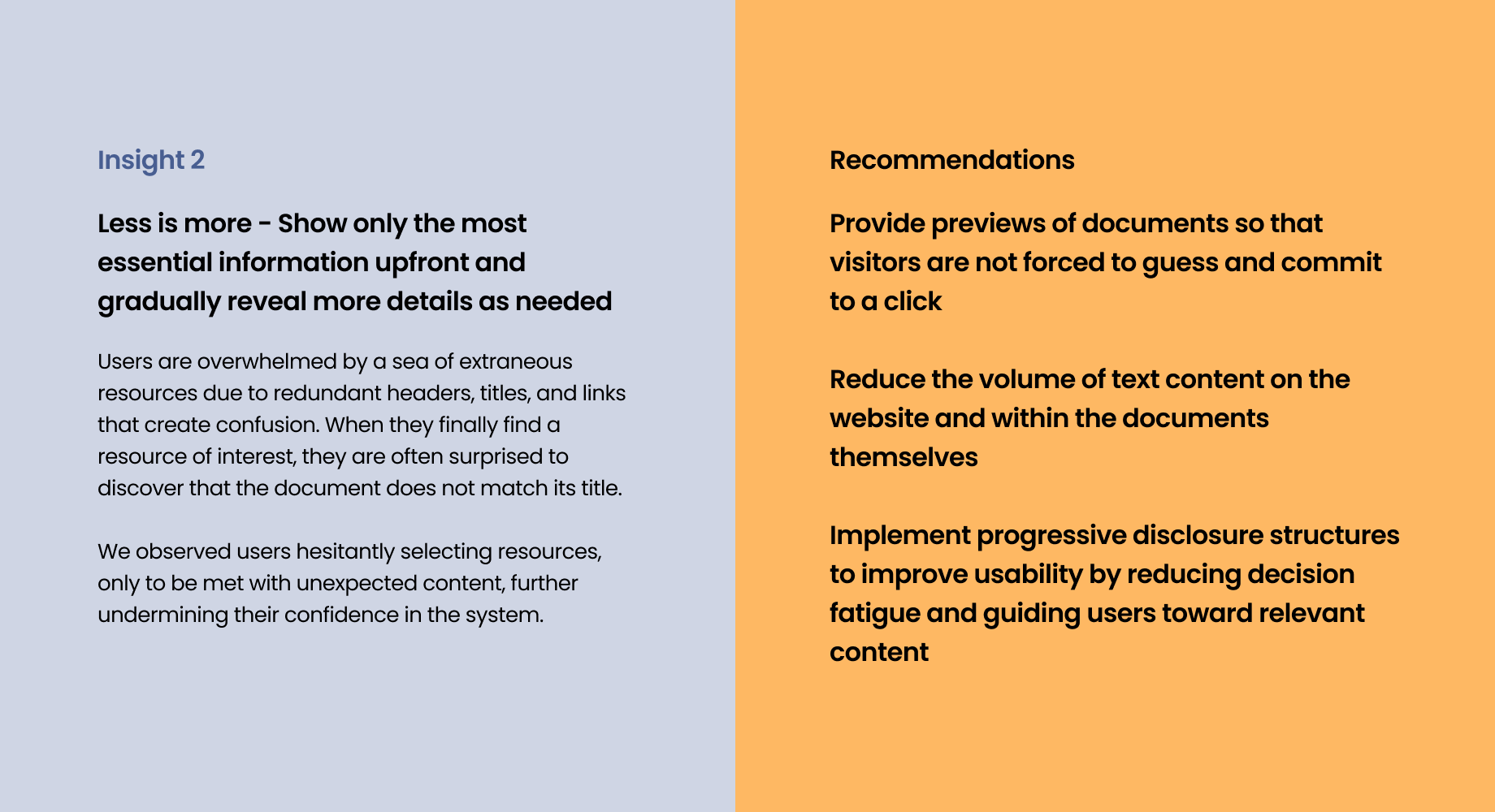
All content on the IM Toolkit site is fully visible rather than embedded, reducing user control over what they can expand. This contributes to cognitive overload, making decision-making more difficult. Additionally, since resources are listed as titled links, it assumes users already understand what each title corresponds to before clicking. This lack of context may create friction in navigation, as users could struggle to identify relevant content

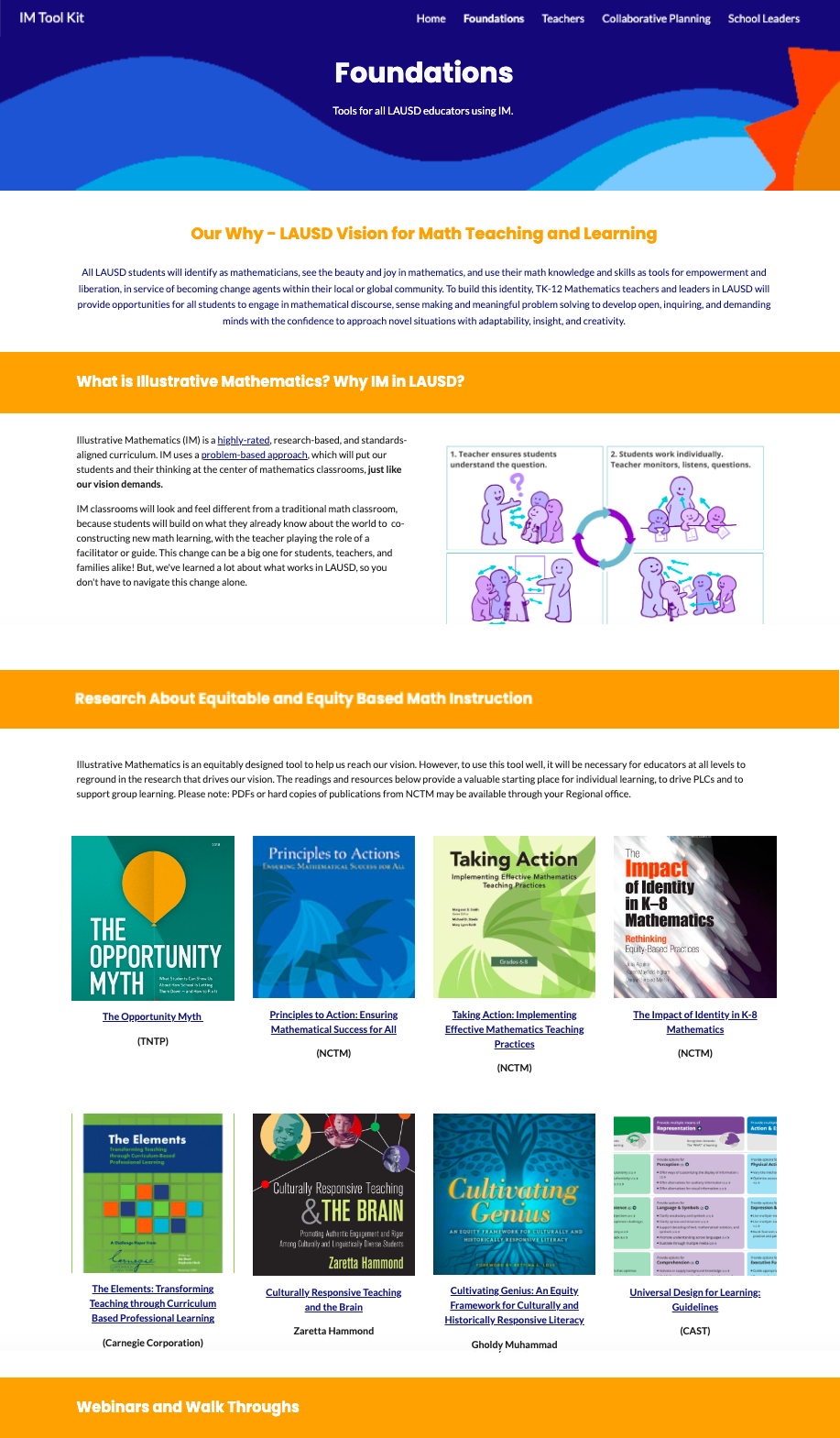
To increase engagement on the site, the focus should be on ensuring users can efficiently complete tasks and find the information they need. The Foundations page aims to explain the importance of Illustrative Math and promote the IM Toolkit’s resources for educators. However, the information presented is too dense, making it unlikely that users will read it all. In addition to the excessive text, there are embedded links that redirect users to different areas of the site, interrupting their progress and increasing the likelihood of them starting multiple tasks without completing any. The content in the Foundations section is more suited for those interested in IM academia, which does not align with the practical needs of educators seeking classroom-focused materials. To enhance user experience and retention, the site should focus on providing high-value, actionable resources rather than theoretical content. This will help convert first-time users into repeat visitors and ensure they return to the site with specific, actionable goals in mind.
The SWOT Analysis provided broader strategic context. While the content audit identified the what in terms of content performance, the SWOT analysis helped identify the why and how in terms of overall site strategy.
Strengths: Aligns with LAUSD curriculum, ensuring relevant materials for educators; supports instructional planning with tools for lesson facilitation and pedagogy.
Weaknesses: Struggles with navigation, cognitive overload, lack of search functionality, and heavy reliance on text without visual hierarchy.
Opportunities: Leverage LAUSD branding to increase adoption, position the toolkit as a central resource hub, and engage administrators for integration into professional development.
Threats: Content may not meet educators’ needs, lack of interactive elements, absence of guided onboarding, and risk of site abandonment due to overwhelming text and unclear direction

Our user pool consisted of those who were already familiar with the IM Toolkit and those who were new to the toolkit. I aimed to deepen my understanding of the diverse groups of educators using the site to better address their needs.
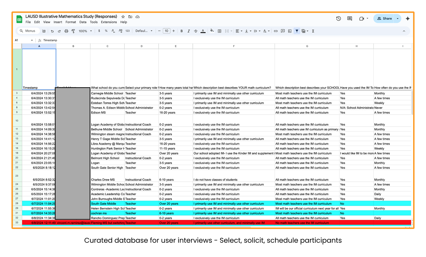
Within both Previous User Experience (PUX) users and New User Experience (NUX) users, there were various types of educators with different roles. To ensure that we gathered relevant insights and feedback, I developed a screener survey to select participants from all groups who met specific criteria and best represented our target audience.
I collaborated with stakeholders to distribute the survey to district staff across the north, east, west, and south divisions, who in turn sent it to schools. However, we faced challenges in recruiting educators from the north and east divisions, as the district didn’t have established relationships in these areas. To fill this gap, I leveraged my personal network of educators from previous roles to ensure we reached a diverse and representative sample.

While we waited for user recruitment, I created proto-personas as an initial framework for the different types of users we were working with and to establish key areas for validation during user interviews.


INFORMATION ARCHITECTURE EVALUATIONI conducted a Treejack study using OptimalSort to evaluate resource findability within the site's existing information architecture.
I began by outlining our research goals to establish the scope of what we aimed to uncover through tree testing.
We wanted to evaluate the findability and organization of content within the toolkit site to determine whether users could navigate the current hierarchical structure effectively
We targeted both previous user experience (PUX) and new user experience (NUX) users to identify usability gaps and ensure a robust information architecture that worked for everyone. Our focus was on testing with teachers, leads, and administrators from both user groups
Begin to establish a logical navigation flow that is not overwhelming, ensuring a seamless and less confusing experience despite the site's large amount of content
include this? Improve website navigation, Content discoverability, Information Architecture
I used Treejack in OptimalSort to design a test for both user groups. Collaborating with stakeholders, I developed realistic, goal-oriented scenarios for both NUX and PUX users. These tasks required participants to navigate the tree, allowing us to evaluate how effectively they could find information within the toolkit website’s information architecture. I then distributed the test to screened users to gather insights.

From this study, I identified three issues that revealed flaws in the IM Toolkit site’s information architecture
Uneven or unbalanced categories
Some categories contained too many subcategories, overwhelming users with choices, while others had very few, suggesting poor organization or redundancy. For example, the toolkit site aims to serve all types of educators—teachers, admins, and leads—which is beneficial. However, within these roles, the abundance of categories and subcategories can create confusion, making it difficult to determine the correct path.
The tree illustrates how users either had to backtrack to try a different route or ended up selecting the wrong resource, complicating the process of finding the right one. Meanwhile, the areas marked 'Nominated as Correct Destination' in yellow, had very few options within their subcategories, which may have led users to perceive them as underdeveloped or incomplete.
Users took a longer path to find the information they needed
Users sometimes navigated through multiple levels of the tree to find content that should have been easily accessible. For instance, in Scenario 5 for teachers and Scenario 6 for admins, while all located resources were correct, some users took longer routes than others. Grouping similar resources together would streamline access.
Additionally, in Scenario 5 for teachers, the 'Working Agreement Setting' resource was found through varying paths—some efficient, others more time-consuming. This inconsistency highlights inefficiencies in the information architecture, indicating a need for a more logical structure to minimize unnecessary steps


Frequent use of the ‘Back’ button and confusion in labeling
Users frequently clicked the 'Back' button to return to previous pages or explore alternative paths, indicating uncertainty about where to go next. Even when they eventually found the correct resource, as seen in Task 3 for leads, the process took longer than necessary because they had to restart and try a different route. This suggests unclear navigation paths or misleading labels, leading to frustration and inefficiency.
Labeling issues were apparent when users chose paths based on names they believed were relevant to their goal but ultimately were not, as seen in Task 3 for teachers and Task 5 for admins.
Confusing or overly technical labels can mislead users, making them second-guess their navigation choices and backtrack in search of an alternate path. This can result in frustration, wasted time, or even failure to find the intended resource. In Task 3 for teachers, users attempted to search for the resource but still navigated back after suggested resources appeared, suggesting that unclear labeling or titles caused confusion about what each section contained.


UX RESEARCHBeyond hierarchical flaws and the site's excessive information, my hypothesis was that the IM Toolkit lacks intuitive organization and accessible language tailored to teachers, school leads, and administrators, making it difficult for them to navigate resources relevant to their roles.
The research conducted so far provided a deep understanding of the site's challenges, allowing me to refine the research objectives and goals for user discussions.

To define the research scope and priorities, I built upon my hypothesis with a list of assumptions, which helped streamline the research efforts.

I conducted 22, 60 minutes remote moderated interviews with Previous Users (PUX) and New Users (NUX) that met the following criteria:
A mix of teachers, coach, and administrator
The school they’re at has adopted IM and teachers primarily use IM curriculum
Equal participants from north, east, west, and south divisions
Range in years of experience in their role
**NUX - Has never used IM Toolkit before
INSIGHTS AND RECOMMENDATIONSEducators need a clear, intuitive experience that aligns with their mental models—showing only what’s essential upfront and cutting through clutter to help them find what matters, fast.
The IM Toolkit offers valuable resources for educators, but its usability challenges hinder its effectiveness. The repetitive process of clicking and downloading files to find relevant content is frustrating, and users—both new and returning—often feel lost due to misleading navigation, with subcategories that don’t align with their needs, leaving them uncertain whether the site is intended for them. The following are the three key insights gathered from user interviews:


Overall, I also noticed 2 key takeaways that would inform design decisions for this project:
General educators, who are not in leadership roles, have limited incentives to engage with the broader IM toolkit.
The most frequently used resources, aside from the pacing guide, include:
Student Work Analysis → Utilized by all PUX
Unit Unpacking → Utilized by most PUX
Lesson Planning Protocol → Utilized by some PUX
Vision/Goal Setting → Utilized by some PUX
IDEATIONHow might we improve the IM Toolkit’s usability to make content easier to find, simplify navigation, and better serve both general educators and school leaders?
I started by grounding my information architecture ideation in our HMW question, aiming to build a logical, strategic, and scalable foundation for a seamless user experience. Drawing from user interview insights, I explored three navigation frameworks designed to mirror how educators naturally understand and move through different phases of teaching.
The first navigation bar highlights the three key phases of a lesson, which are essential for educators when planning and delivering instruction. Each phase focuses on different elements of teaching and learning, ensuring effective knowledge transfer and student engagement. This structure helps educators organize content, assessments, and instructional strategies to foster more impactful teaching and learning experiences.

The next navigation organizes the site's content into four interconnected phases that support educators in continuously improving their teaching practices while adapting to the evolving needs of their students. This cyclical approach enhances understanding and fosters more meaningful learning experiences and I chose these terms to best describe the four phases.

The final navigation framework structures resources according to three key phases of instructional planning: before, during, and after a lesson. This chronological approach enables users to efficiently access relevant content by selecting a phase from the top navigation, allowing them to immediately narrow their search based on the specific stage of instruction they’re interested in.

In collaboration with stakeholders, I presented three navigation frameworks, each with a clear rationale. One key insight from feedback was the challenge of overlapping roles—while coaches may also teach and have access to a broader set of tools, teachers typically don’t use the same resources as coaches or admins. If the top navigation prioritized admin-focused content, teachers would be forced to sift through irrelevant materials, leading to unnecessary friction. This echoed what we heard in user interviews: for instance, a coach might access a resource to support a teacher, but that doesn’t mean all coach or admin content should be visible to teachers. Mixing these would risk overwhelming and confusing users who need a more streamlined experience.
After receiving approval to move forward with the converged version of the Toolkit navigation, I began creating rough sketches to explore how the site might function, look, and be structured. This allowed me to test different ideas and select the most effective path for further development.


At this stage, stakeholders confirmed that due to budget constraints, we would not be pursuing designs that required coding, as they lacked the resources to hire developers. I then researched web development platforms that could be used within LAUSD schools without being blocked by the district's server restrictions on privacy and content filtering. Google Sites emerged as the best option due to its compatibility with LAUSD guidelines, its seamless integration with Google services, and its ease of use, which would allow stakeholders to update the site in the future as needed.
FINAL DESIGNA redesigned IM Toolkit website featuring a clear and strategic information architecture, improved navigation, and easier access to resources—structured to reflect how educators and school leaders naturally approach their work.
Due to the constraints of designing the IM Toolkit using Google Sites, my design options were limited in terms of aesthetics and functionality. However, I built on the initial sketches and concepts I developed in collaboration with stakeholders. While exploring Google Sites templates, I focused on selecting layouts that aligned with the envisioned content and functionality. This approach allowed me to refine the concepts and still create a user-friendly site, reducing overwhelm and making it easier for educators to find resources effectively. The new design is minimal, intuitive, and supports users in finding what they need with ease.

I applied the LAUSD brand guidelines—covering typography, color schemes, and visual identity standards—to ensure the design aligned with the district’s established look and feel. This maintained visual consistency, professionalism, and brand cohesion across all LAUSD materials and digital touchpoints.

DELIVERY AND RESULTSOur client implemented our concept of the My Favorites feature resulting in a 20% decrease in customer service calls and phone orders to the bookshop.
I delivered the redesigned IM Toolkit website and presented how the improved information architecture, content hierarchy, and layout effectively addresses user needs and pain points while aligning with key stakeholder goals.
Since launch, the site has seen a 65% increase in visits and an 80% improvement in resource discoverability for the 2024–2025 school year.