Homebuddy - Building a trusted service for first-time homeowners to help them prioritize and be proactive about household maintenance and responsibilities.
Homebuddy’s CEO aimed to change the direction of his startup from a homebuyer’s educational hub to a service that assists homebuyers through the searching and purchasing process.
Spearheading research, I helped our team discover our area of opportunity to be after the closing phase of the home-buying experience, allowing Homebuddy to have a competitive advantage in the real-estate market. I built the home maintenance suggestions feature that manages tasks and provides step-by-step guidance for DIY projects or finding a professional to complete the task.
Our design solution helped our client get funding for Homebuddy resulting in a 15% increase in signups.
Role and Responsibilities
UX Designer - UX Research, Information Architecture, Product Design
Timeline
January 2019 - May 2019
Tools
Figma, Google Survey
Platform
Web
Homebuddy was not doing well in the market, conversion rates were low and bounce rates were high.
Homebuddy’s CEO asked our team to discover and design a service that Homebuddy can offer users, that is competitive within the real-estate market. Originally, the startup focused on providing educational resources to homebuyers however their value proposition didn’t meet user needs due to the lack of engagement and conversion. Our stakeholders were looking to pivot to a service that assists homebuyers through the searching and purchasing process. They wanted us to work in the idea of having a digital Homebuddy realtor that would guide homebuyers in the home searching process, which they believed would positively disrupt the market.
The Problem
I stressed the importance of having a holistic understanding of the homebuying space and validating our assumptions early.
Knowing very little about the home buying process and homeowner responsibilities, I dove into an analysis of our domain. We learned about the potential behaviors of homebuyers and homeowners and the value professionals in the homebuying space offer.
Quantified Online Research
75% of homebuyers are searching for a home use Zillow to look at houses, before contacting a trusted real estate broker
Over 80% of homeowners prefer to hire a professional for home issues and repairs
68% of homebuyers recognized the value of a home inspection before placing an offer on their home
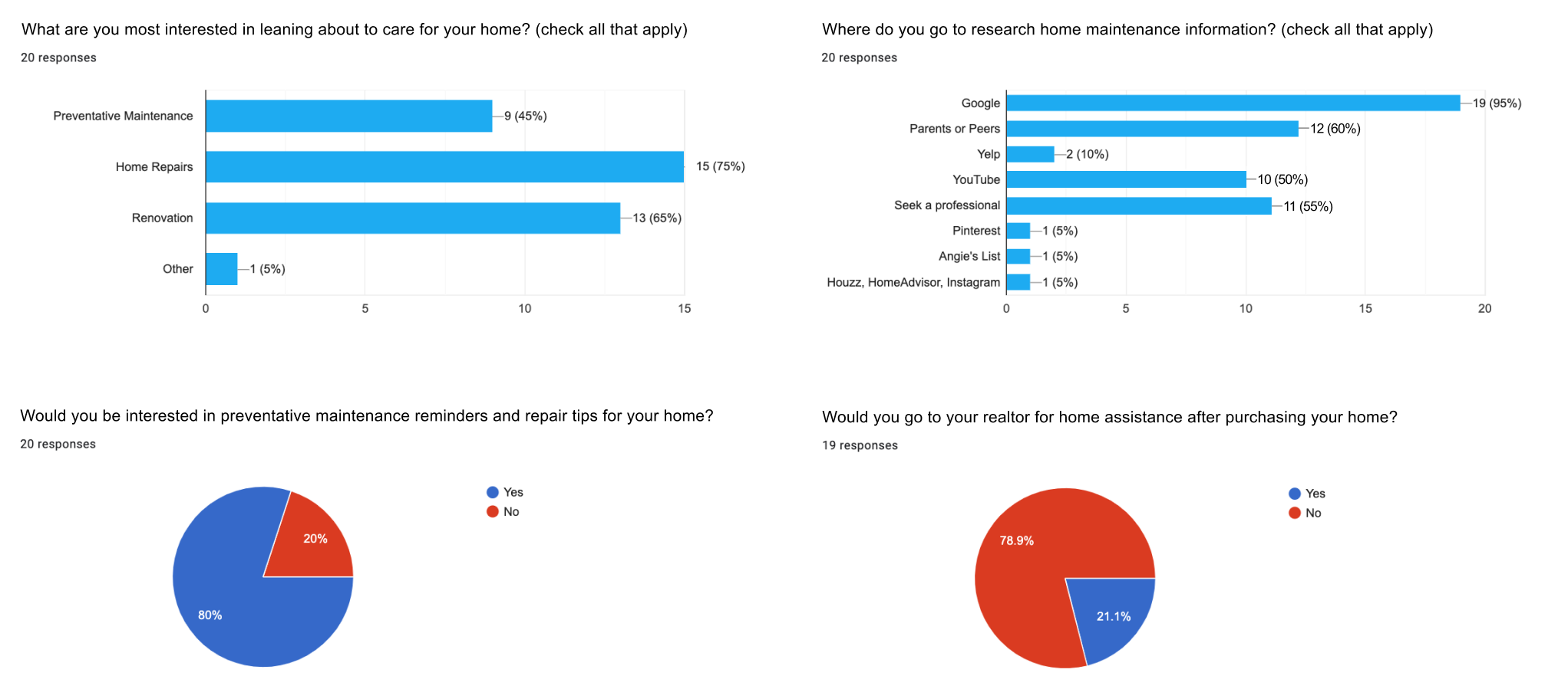
Next, we put together a user survey to quantitatively validate the assumptions we had about homeowners’ maintenance concerns when buying a home.
Domain Analysis and User Surveys
Survey data of 22 participants was gathered showing:
50% Are comfortable DIYing projects for their home
80% Wished they had a home inspection before placing an offer on their home
75% had to carry out more than 2 home repairs after moving in
79% Would not go to their realtor for maintenance and repair referrals
I used this information along with the domain research to help our team formulate meaningful questions in preparation for user interviews.
I conducted 1:1 semi-structured research sessions to better understand the behaviors, motivations and pain points of our users when buying a home.
I outlined our research goals from our earlier discussions with our client to help define the project scope and ask questions to help address the problem at hand.
Our Research goals:
1. What are notable behaviors, motivations, barriers and technologies that impact millennial homebuyers?
2. Understand users’ experience within the home buying space (ie: with their realtor, broker…etc.)
3. Identify user needs and opportunities to help inform the product strategy.
The clear objectives helped me create a discussion guide of questions to ask participants. The semi-structured format provided the opportunity to explore topics that were not previously thought to be relevant but added valuable insights when probing users to elaborate on answers with follow-up questions.
I conducted in-person and remote interviews with 4 homebuyers and 3 homeowners between the ages of 26 - 38 from our stakeholder’s user database. Secondarily, I conducted quick interviews with 3 SMEs for a broader perspective.
UX Research
Our discovery didn’t align with our client’s idea about the Homebuddy realtor service.
Research Synthesis and Key Takeaways
After a thorough examination of our insights we concluded that:
1. Re-inventing the role of the realtor doesn’t address our users’ needs.
2. Users are comfortable taking the steps to find and put an offer on a home, but aren’t as confident dealing with home responsibilities as a first-time homebuyer.
3. When it comes to maintenance repairs, users are more reactive to issues than proactive.
4. They don’t see themselves as handy around the house, and though they are comfortable with small projects, they prefer to have someone take care of large and immediate repairs.
I set up a meeting to present our discovery to our client to align UX strategy with business goals.
I began by taking our client through the phases first-time millennial homebuyers experience, through our synthesized findings reflected in a journey map, and our persona Jeff.
I highlighted:
The phases our users are comfortable going through to find a home
The pain-points that arise during closing and the journey that lies ahead as a homeowner
Our area of opportunity for Homebuddy once the user is a homeowner with responsibilities
Our client was impressed by our research and we were able to gain alignment on the direction our team was taking to create the Homebuddy MVP.
User Persona and Journey
How might we assist millennials with their home responsibilities and needs as first-time homeowners?
Ideation
We began brainstorming by asking “how might we” questions to get a broad range of ideas, narrowing it down to 2 questions appropriate to each scope. I captured ideas into early sketches to quickly test with users. This helped me determine which concepts I should move forward with to flesh out and focus on the interaction design.
1. How might we guide Jeff in taking proactive measures and do home maintenance?
Considering that our users knew little about home ownership and tend to be reactive, I aimed to ideate easy to digest visuals to provoke a response in taking action.
Concept 1.3 tested best. Users cited this concepts as easy to understand and the most effective in triggering a response to do maintenance. They felt concepts 1.1 and 1.2 gave them cognitive overload, citing the content to be overwhelming and not easily guiding their eyes to necessary information.
2. How might we allow Jeff to interact with Homebuddy to increase retention?
Knowing that our users aimed to be proactive, and our business goal was for users to use and keep coming back to Homebuddy for their home maintenance needs, I focused on ideating interactive and guiding features and validating for user expectations.
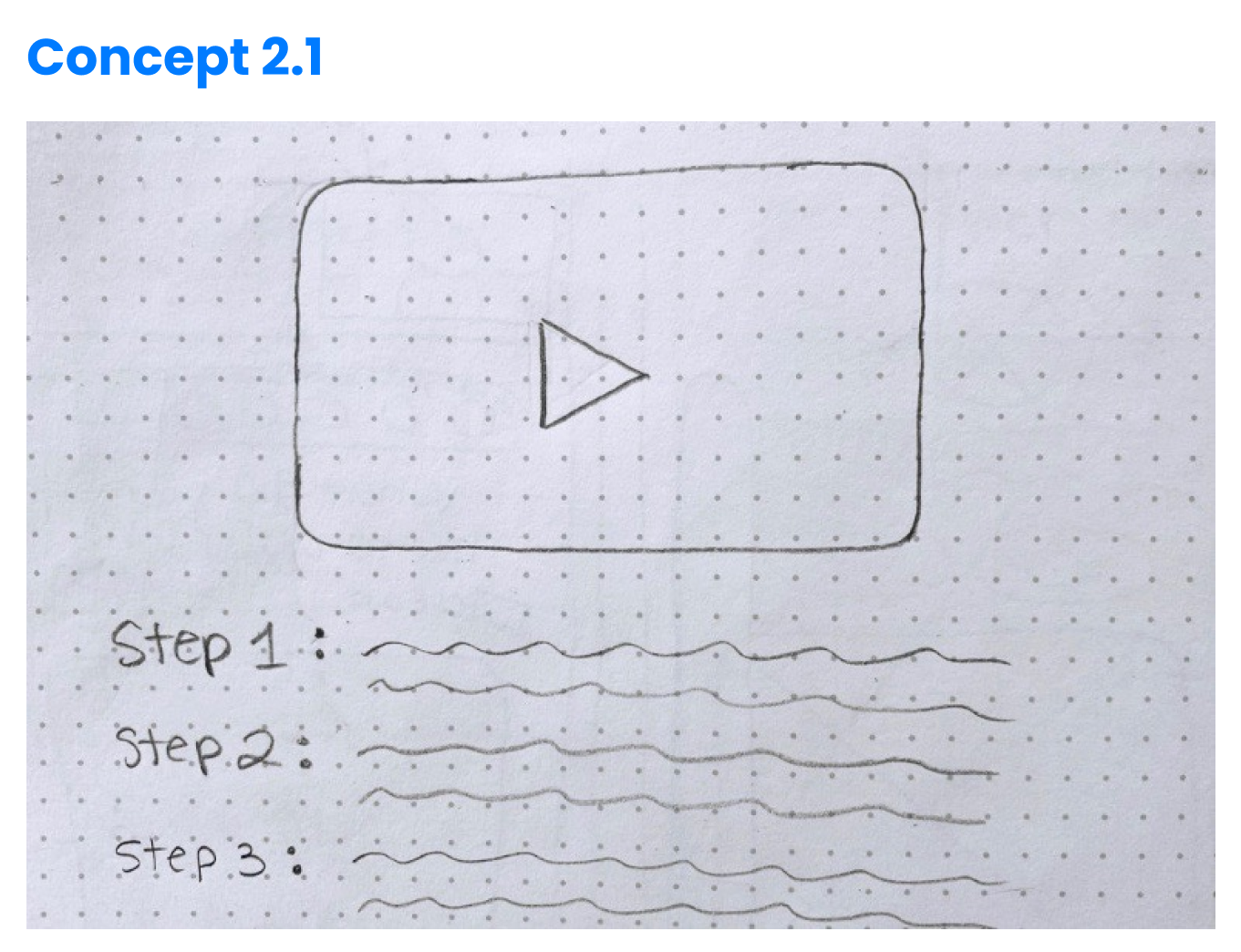
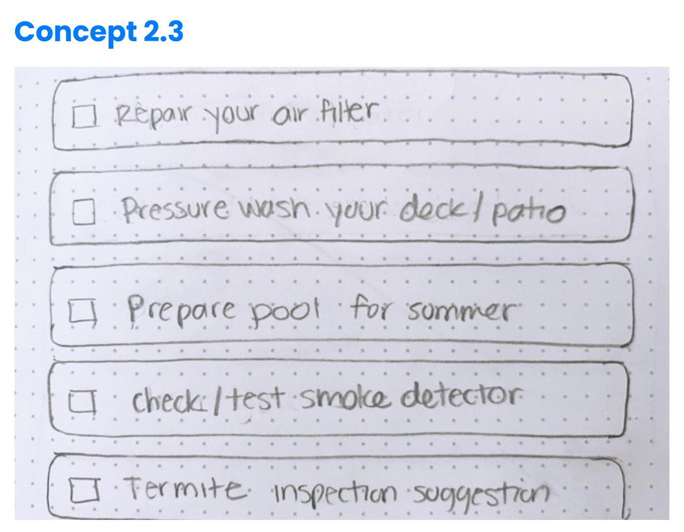
Concepts 2.2 and 2.3 were more compelling in prompting a user response while concept 2.1 was seen as helpful. Users liked being able to track water and energy consumption to essentially save money (2.2) and liked the idea of preserving the quality of their home by having a space for maintenance suggestions (2.3)
I built out the product experience keeping in mind dev constraints and efforts.
Knowing what I learned from the quick concept testing sessions and a team critique focusing on feasibility and outweighing the efforts and impact, I converged the concepts that made the most sense in prompting the user to take action into mid-fi wireframes. I focused on the user flow before testing to ensure intuitive actions and straight forward accessibility.
User Flows
Usability Testing
Testing the Product Experience
Our team put our designs to the test by observing how easily participants were able to navigate through Homebuddy with given scenarios for each part of the MVP.
Scenarios for home maintenance suggestions:
1. Your home inspector gave you a report regarding the condition of your home, and you want to stay on top of future home responsibilities. Please create an account and add a maintenance task.
2. Summer is coming and you just finished building your pool and remembered to add your maintenance task. Show us how you would complete “Prepare Pool For Summer” to your tasks list.
Iteration 1: Issues with credibility and cognitive overload
Users wanted to understand why they needed to take action versus seeing monetary data indicating different maintenance actions to take.
I replaced the graphs with clear and concise copy explaining the maintenance suggestions and added context to the two CTAs to inform decision-making. The dashboard already included another graph and we didn’t want to overwhelm the user with visual data. To keep information less overwhelming, I made the list of monthly maintenance suggestions collapsable.
Iteration 2: Issues with flow
Users questioned how long the on-boarding process would take and didn’t like clicking on “back” repeatedly to find the first pages of the flow.
I added a breadcrumb trail at the top of each on-boarding page to reduce friction and ensure that every step of that path is clickable, all the way back to the 1st page. This allows users an alternative way to navigate this flow, while lowering bounce rates and increasing the chances of finishing signing up.
Iteration 3: Issues with information architecture
Users stated the DIY step by step directions felt too wordy like a blog instead of a guide
I minimized the copy to highlight necessary information the user needs to know, and I reorganized the content to better guide the user in completing a task. I also included the tasks item listed in the Dashboard on the Home Maintenance Suggestions list, as a shortcut for the user to check off when the task is completed.
Iteration 4: Issues with information architecture
Users stated the DIY step by step directions felt too wordy like a blog instead of a guide
I minimized the copy to highlight necessary information the user needs to know, and I reorganized the content to better guide the user in completing a task. I also included the tasks item listed in the Dashboard on the Home Maintenance Suggestions list, as a shortcut for the user to check off when the task is completed.
A platform that aids homeowners' responsibilities and budgetary needs.
The home maintenance suggestions feature manages tasks and provides step-by-step guidance to DIY or find a professional to do it for you.
The Final Design Solution
Our solution resulted in a 15% increase in signups.
My team and I presented our solution to our client and delivered our prototype with annotated wireframes. They showcased our work at a the Center for Entrepreneurship and Innovation conference, and got accepted into a New Venture Capital Accelerator to get funding. 2019 New Venture Chapter Accelerator. Ryan used our annotated wireframes to communicate design decisions to his development team, determining the feasibility of implementing the new features.
Since then, there have been major changes to Homebuddy, now live at homebuddy.co resulting in a 15% increase in signups.
The Homebuddy team is slowly growing and is currently conducting further testing to determine the logistics of feature implementation for finding a professional and developing an algorithm to provide monthly home maintenance suggestions. I’m looking forward to the upcoming iterations that will continuously add more value for homeowners and Homebuddy.
Delivery and Results


